Tuesday 12 October 2010

What iv learnt and what im going to do from here

The Yo sushi brand.
I have discovered from my research that the yo sushi brand is fun, bright, colourful happy and very youthful looking. They use alot of vector art witch is a style that alot of young people like, i have used it before in my work and people always like that style over all the others i have used so vector art has to be in there (yo sushi use it, and young people love it, sorted). They also use Kimmi dolls with speech bubbles to advertise deals and other things on the website so its possible that a kimmi doll would be a good thing to have in there.

Art Style Research
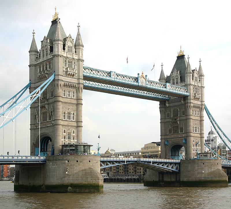
From researching artist i have decided that i want to use a paint based background to give it a messy arty style i have used this technique before and its looks shit hot if done well (a thank you for Richard Hatton for the messy art lessons) on this a London landmark such as the tower bridge will be drawn with something like stick and ink quite abstractly and simplistically for a background image. I will also try this without the image and just have a distressed background.
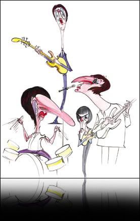
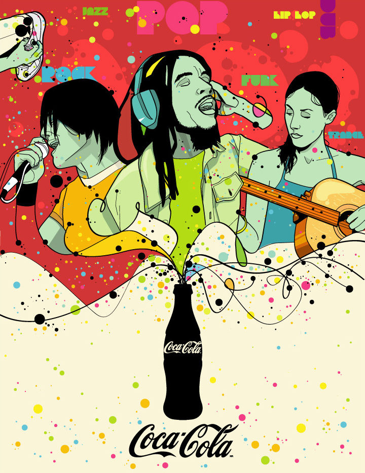
On top of this for the main images i will use vector art in the style of somebody like Rubens Lp (who is my favorite vector artist) and a mixture of that and hand drawn illustrations (probably Gerald Scarfe influenced) . This will be mixed in with some vector swirls and other random assortments of graphics witch seems to be the vector art way. I could mix this in with some sushi/Japanese bits and bobs such as fish, chopsticks and kimmidolls. 
I also may get a punk influence in there, im a huge fan of punk and the sex pistols and the clash were two of London's biggest bands.

None of this is set in stone, im hoping to do alot of experimenting and new ideas may pop into my mind.

Things that will/may be in my mural.

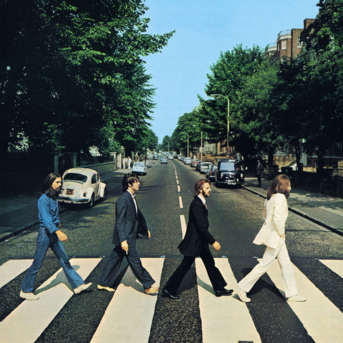
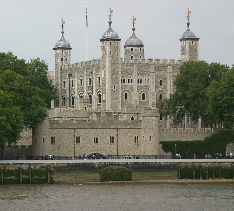
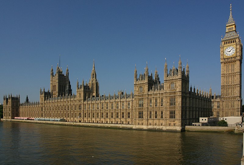
When i think of London i immediately think of tower bridge, The queens guards, English bobbys, punk, the stones/the who, red busses and big Ben. I imagine most people get that image or a very similar one when someone says London.
So my mural will be made of iconic London images landmarks and idols with some japaniese stuff mixed in there as well. 

The style i have chosen fits the yo sushi brand and it will appeal to the younger people that use fast food places such as yo sushi.....time to get drawing.

Gerald Scarfe

Gerald Scarfe is by far my favorite illustrator, i just love his very unique style of drawing, i have tried to duplicate his style many times sometimes coming close other times failing. His style may or may not suit the yo sushi mural because it can be quite sinister looking sometimes but that doesn't mean it cant be tweaked to suit a younger audience. They did exactly that for the Disney film Hercules.


Tuesday 5 October 2010

awsome Cineworld video thing

Graphic Style research Part IV

Silke Werzinger

I really love the style of this artist, the messy style is fun and youthfull looking so with some added brightness it would look good for the yo sushi mural.


Nik Ainley


Graphic Style research Part III

Koa
Koa is a great illusstrator but his style is a little bit sinister and wouldnt fit in with yo sushis happy fun branding. 

 He wents to a graphic design high school for 3 years, after a long time of self-education and a high school of Communication. He worked in a french agency as Artistic Director, where he made 2d animations, webdesign, graphic design and other stuff (during 5 years). After that he realised WAR OF MONSTARS book with the big help of THE LAZY DOG (Paris) this project was a tribute to Kaiju Eiga films. He is actually working on a new book called SANG NOIR. A black and white illustrations book with other artists like he does for WAR OF MONSTARS.
His world is a universe of happy and colorfull oppresive chaos where monsters are masters and humans are slaves. Monsters fascinate him since he is a little kid. His universe is full of barbed women, dwarfs hip hop masters, clouds who laugh about humans, flying fishes who want to be rock stars, fearfull wherewolfs, ridiculous ghosts, strange dogs, shintoist gods, religious symbols, occult symbols, tattoos...
Mirror of our hearts his creatition takes part of our fears, fantasms for strange things. His creations are the echo of our falling civilisation where the human Insanity, violence and sex is everywhere but always with humor. But it s always turned to ridiculous and funny things, he doesn t want t chock people with his little monsters but more make them laught.


Graphic Style research Part II

Rubens Lp

Rubens lp is one of favorite illustrators, his style is very unique and intresting. The style would work great on the yo sushi mural cause its again bright, fun and youthful.


Graphic Style research

Here i will research into different artists and then afterward decide what style or more likes styles i will use on my mural and then i can get stuck into experimenting with different ideas and finding out what works and what doesn't work.

Steve Wilson

Steven is an Illustrator who lives and works in Brighton, UK. Originally from North London Steven fell in love with Brighton whilst studying on the renowned Illustration course there. He can often be found foraging through the local flea markets for obscure books and discarded paraphernalia to use as inspiration. Circus posters, fairgrounds, victorian postcards and tribal body art are amongst the themes he cites as reference for his varied and experimental work which he generalizes as 'somewhere between pop and psychedelia'. His working processes are as eclectic as his influences. Pen, pencil, paint, collage and even play-doh are combined with contemporary tools like photoshop and Illustrator to create his work.
He has a particular passion for working on album covers as he enjoys their permanent nature. "I like the idea that with an album sleeve the artwork is forever associated with that album and so you are creating a little piece of history." 

Steve wilsons style would be great for the yo sushi mural because its bright, colourful and fun like the yo sushi brand.
  
Clients include:
MTV, Coke, NYCGO, NIke, Virgin, Selfridges, Neiman Marcus, BBC, LEVI's, Penguin books, Sony BMG, The Fader, Julien Macdonald, Wallpaper magazine, Blackberry, 3 mobile, Ecko, Universal, Nike and design week.

About Yo Sushi part III

The Design of the building

I wouldnt actualy go to a sushi restaurant because the the thought of raw fish makes me want to be sick, but from what i have seen of photographs it all looks good
The interior and exterior of the buildings are just like everything else that belongs to yo sushi, bright, colourful, funky and fun and thats what gives yo sushi its branding style, this appeals to young people wanting to have some fun healthy fast food


.

About Yo Sushi Part II

Fast! Fun! Fresh!

Bet you thought sushi was just raw fish? Sushi is, but YO! Sushi isn't. We serve over 90 Japanese inspired dishes on our menu including hot classics, sashimi, tempura, salads, hand rolls and desserts. So whether you love meat, fish or vegetables, don't panic, you're catered for.

The logo

 The logo is very funky looking, bright and fun, this shows that yo sushi wants to be thought of as funky and fun and not like a posh restaurant with pictures of landscapes and velvet curtains.


Other Graphics


This is very modern looking vector art, very simplistic. The sun beams look very Japanese and give it the right look. 

Vector art would be a great style of art to include on the mural as it will fit in with yo sushi's branding.


Kimmidolls


Yo sushi use kimmidolls in their branding alot, obviously they look Japanese so they fit in well with the branding and it makes the website look quite fun to have them spread around with speech bubbles advertising the latest offers ect.

About Yo Sushi

This is from the about section on the yo sushi website.


Founded in 1997, YO! Sushi brought the concept of a Japanese ‘kaiten’ sushi bar that delivered food to customers via a conveyor belt travelling 8cm per second to the masses, and became the original and most famous sushi brand in the UK. YO! Sushi was a brand new concept in dining and catapulted Londoners into the 21st century which made us the most talked about dining experience. Our customers queued around the block as we gave the capital a slice of Urban Tokyo. The experience was fun and exciting, whilst the food was revolutionary and made lovingly, as AA Gill (Sunday Times) pointed out in his review stating it was “the best sushi in London" and Fay Maschler (Evening Standard) said she had “seen the future and it is fun".


By 2001, YO! Sushi was the market leader in sushi restaurants and (we like to think!) inspired supermarkets to start selling packaged sushi to the Great British Public, allowing people in areas where YO! Sushi restaurants hadn’t arrived yet to take their first steps in discovering how tasty and healthy sushi can be.
To this day, YO! Sushi’s dishes are freshly prepared in our restaurants daily by our nifty kitchen ninjas, whether to dine in, for takeaway or delivery. Although sushi is at the heart of our concept and brand, you can choose from over 80 Japanese inspired items, including delicious soups, rice or noodle-based dishes, salads, tempura and even hot classics like Chicken Katsu Curry, Salmon Teriyaki or Yakisoba noodles (some of our best sellers).
For the past 11 years YO! Sushi has been led by our CEO, Robin Rowland and with the help of our leadership team, we’ve grown from a London-only sushi brand to an international iconic success with over 60 restaurants worldwide. YO! Sushi is privately owned by Quilvest and the YO! Sushi senior management team in the UK, and we work with the very best franchise partners to bring YO! Sushi to locations internationally.
We serve over 3.5 million customers a year throughout the UK and across the globe in Moscow, Dublin, Dubai, and Kuwait … phew, now that’s a lot of maki rolling!

Monday 4 October 2010

What do you think when you say london part IV (music 2)

 
The who and the Rolling stones
The who are an incredibly famous hard rock band, with the iconic whirlwind guitar playing of Pete Townsend. They usually used colours of the British flag and sometimes the flag itself on their album covers and promotional items.


The rollingstones
The rollingstones were just as big as the Who if not bigger, the signature lips and tongue are at the frontline of their graphics and branding campaign and everybody knows that this image on its own means the rolling stones just as everybody knows the bat symbol means batman.


What do you think when you say London Part III (music)

Music - If this is aimed at 15 - 25 year olds music would be an important part of it, London has had alot of famous musicians that people of all ages will of heard of such as the sex pistols and the clash.

Abby Road
Abby road studios is an incredibly famous recording studio in London were everything from albums to film scores are recorded.  Most famously the Beatles album Abby Road with probably one of the most famous album covers of all time.


Punk
One of the most famous music scenes of all time, made famous in London by bands such as the clash and the sex pistols.
 
Who would of though torn up union jacks, paper clips, randomly placed type cut from magazines and defacing the queens image could looks so good. ANARCHY!!!


The punk art style would look great if it was on the mural at somepoint, maybe if it actualy says london in punk style lettering?


What do you think when you say London Part II


Red Busses and phoneboxes
You dont get much more London-Esq 
than the classic red busses and phone boxes.


Palace Guards
The Buckingham palace guards with the stupid hats and silent lips are extremely well known, i imagine there isn't many people who visit London who don't want to at least try and make a guard laugh move or even smile.


English bobby's

Quite possibly the stupidest looking police force in the work, with the bell end cone head hats, but everybody knows what they look like.

What do you think when you say London. (landmarks)

The tower bridge

The London bridge is a very iconic image and would have to be on the mural at some point and i think this would make a good background image.


The tower of London

The infamous tower of london, this is the place you were sent to when you got on the wrong side of the person who was ruling at the time, lots of people were tortured and executed here. It was also a place for the army to store weapons and live.


The houses of parliament and big Ben

The houses of Parliament is the place were all the boring stuff happens that i dont really care about but the building looks nice and its quite iconic, it was recently seen and blown up in the film V for Vendetta and attempted to be blown up famously by Guy Forks. Big Ben is a very famous and iconic clock well known from being the main image of news at 10.


The London eye

The London eye is a giant ferris wheel that tourists can go on to get a great view of London, the wheel takes 30minutes to rotate so its not like a fair ground attraction. The London eye is a very modern looking thing and would proboly look good on the mural.


Buckingham Palace and Royal family

Im not sure why we have a royal family to be honest when the country is run by a Prime minister but the posh talking big toothed royals are quite iconic, well more stereotypical than iconic. The palace is an iconic building and everybody knows what it looks like so even though its a bit obvious it would work.   

Rome scrapped

I have decided to go for the city of London insted of Rome as i feel it would be more suitable for this project and i would get a more modern looking final piece.

Friday 1 October 2010

What do you think when you say Rome? Part I

Here i am researching into the things that make rome, rome.

The Colosseum

 This is deifinately the most iconic building in Rome, the building were slaves and animals were forced to fight to the death to entertain the citizens of Rome. Just that they could build things like this back then is pretty amazing.


Gladiators and the Centurion soldier

The soldiers of rome and men who were forced to fight in the colessuem and  the clothes they wore are iconic themselves as much as the building. Everybody knows what a gladiator and centurion looked like so it would make a good branding image. But then again voilence related things may not be what you want on the wall of a sushi place.
(i also like the art style of this image)


Vatican City & the Pope


The vatican is an amazing looking place full of great buildings, statues and artwork (it all looks very expensive)
The vatican is obvously a huge part of rome, especailly when a new pope is being elected and thousonds of people go to see whos the new right hand.


I dont know if it would be suitable to have a pope on a wall in a sushi bar i think it could possibly offend christians and none christains alike. But he is quite iconic none the less.

Which city?

My project brief is to design a wall mural for a Yo sushi resteraunt for a city of my choosing, obviously some citys will be easier/more intresting than others. I am deciding between Rome, a city i have always had an intrest in due to the history and London my own capital city.
The problem with rome is its very historical, all old ruins, the colloseum, gladiators, statues of semi naked people and of course the vatican city. A city is what it is and allthough i could do rome in a modern style it will be all old stuff and a pope (who is almost old enough to remember gladiators).
London has a nice mix of the old and the new, such as the tower of london, the big bridge thing, the palace and newer things such as the millenium bridge, london eye and the biggest waste of money ever the crappy gient tent, aka the dome. I would like to do two, one for each city but i doubt i would have time.