Im really pleased with how this project turned out and how my illustrations turned out most of all, I always wanted to learn to do vector art and for my second...or third attempt it turned out quite well. I have done it in my own style. This was risky and i found it really frustrating as im not all that familiar with vector art/illustrator, but it was worth the risk.
I would rather fail at trying to do something a little bit unique and something i would be proud of than just live trace photos off the internet with one click of the mouse. I would of liked to do more parts to the mural, but having spent alot of the last few months with head ache its not gone smoothly.
I wont talk about the work anymore as i have evaluated all the way through this blog and i would just be repeating myself.
Thursday, 3 February 2011


Direct mail final

The half price bus fare is something that i stole from the train company, you can get something called a plus bus ticket when you buy a train ticket were you can travel from the station for next to nothing.
Final Menu


The final menu isnt much different from the draft but iv taken away the shitty grean and yellow swirly thing, added the new mini and done some subtle rearanging of some bits. I have gone with the same colour coded thing as YO! sushi did for the prices but i have kept it really simple to go with the illustrations (and so i didnt have to download and edit dozens and dozens of pictures of raw fish).
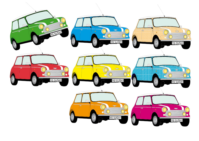
One more drawing (mini cooper)
I wanted to have another car to go with the bus and i thought what better than the classic mini cooper.
 This is the sketch.
 Some quicky colour tests using the boring fill tool for everything.
 The final mini colourd using the same method as everything else so far. I went with red to fit in with the bus and the queens guard.


Subscribe to:
Comments (Atom)